***
title: Widget
sidebarTitle: Widget
description: Embed your voice agent directly on your website.
-------------------------------------------------------------
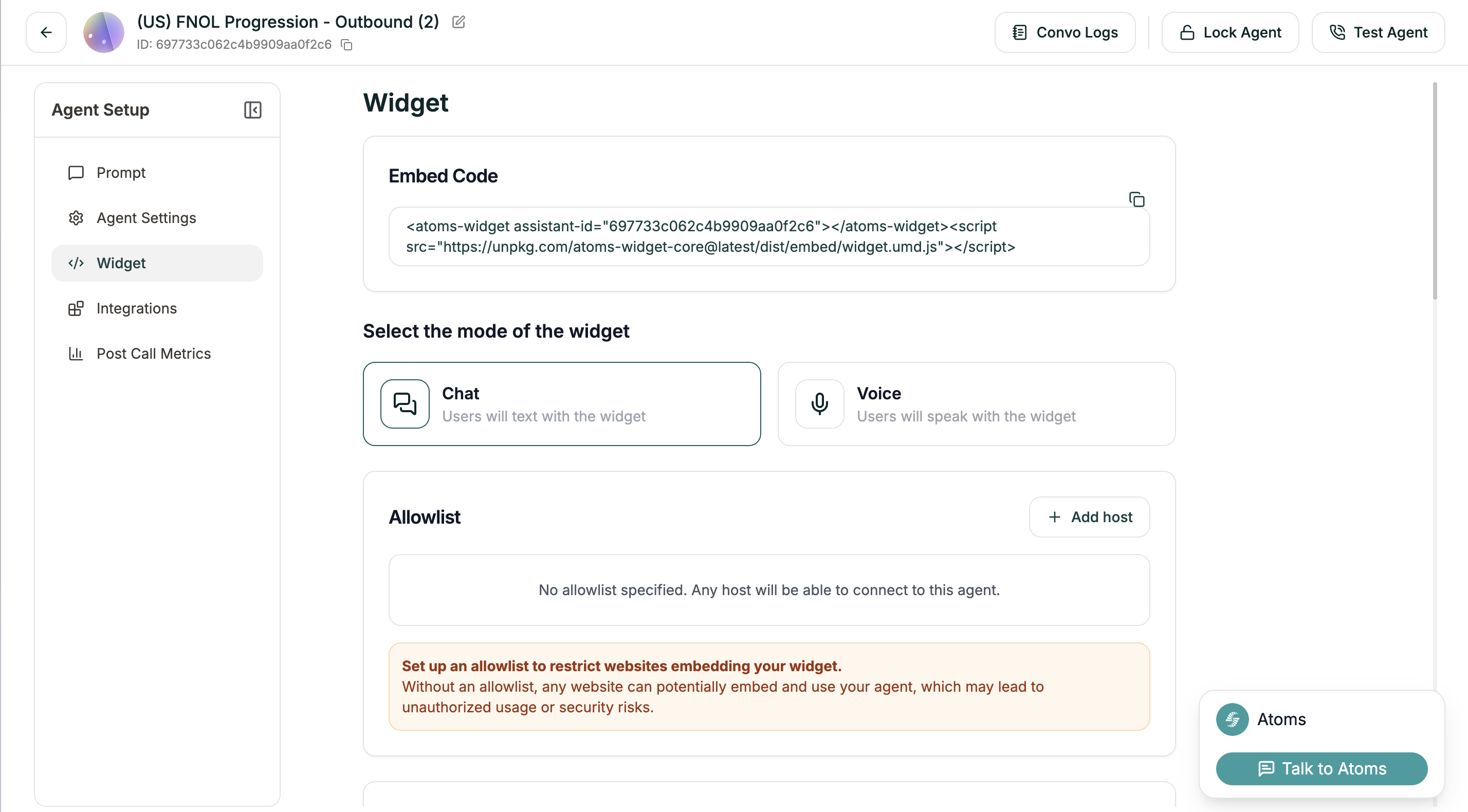
The widget lets visitors talk to your agent without leaving your site — no phone call needed. They can either text or speak, right from their browser.
**Location:** Left Sidebar → Widget
***
## Embed Code
At the top, you'll find your embed snippet. Copy this and paste it into your website's HTML.
```html
```
That's it — the widget will appear on your site. Everything else on this page customizes how it looks and behaves.
***
## Mode
Choose how users interact with your widget:
| Mode | Description |
| --------- | --------------------------------------------------------------------------------- |
| **Chat** | Users type messages. Good for quieter environments or when voice isn't practical. |
| **Voice** | Users speak directly. The full voice agent experience in the browser. |
Pick based on your audience. Voice feels more natural for most support scenarios. Chat works better for quick questions or when users might be in public.
***
## Allowlist
By default, any website can embed your widget. That's convenient for testing, but risky for production.
**Set up an allowlist** before going live. Without one, anyone could embed your agent on their site, potentially running up your usage or misrepresenting your brand.
Click **+ Add host** to specify which domains can use your widget:
```
yourdomain.com
app.yourdomain.com
```
Only these sites will be able to load the widget.
***
## Appearance
### Variant
How much screen space should the widget take?
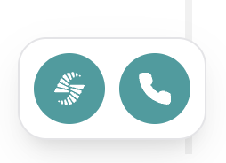
Minimal footprint. Just a small button that expands when clicked. Best when you want the widget available but unobtrusive.
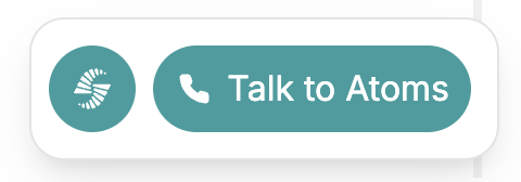
Balanced size. Visible enough to invite interaction, but doesn't dominate the page. Good default for most sites.
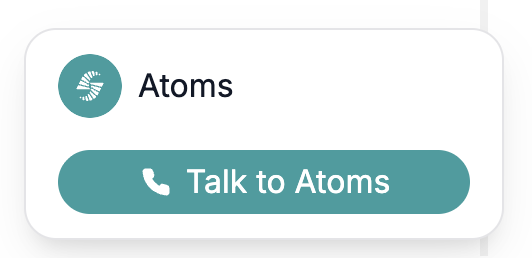
Prominent and hard to miss. Use when the widget is a primary way users should interact with your site.
### Placement
Where the widget button appears on screen. Currently supports **Bottom-right**.
The preview on this page always shows bottom-right. The placement you choose applies when embedded on your actual site.
***
## Theme
Make the widget match your brand.
| Setting | What it affects | Default |
| ---------------------------- | ------------------------------- | --------- |
| **Widget Background Color** | Main widget background | `#ffffff` |
| **Brand Accent Color** | Buttons, highlights | `#2d9d9f` |
| **Agent Message Background** | Agent response bubbles | `#f3f4f6` |
| **Text on Accent Color** | Text on accent-colored elements | `#FFFFFF` |
| **Primary Text Color** | Main text | `#111827` |
| **Secondary Text Color** | Subtitles, hints | `#6b7280` |
Click any color to open a picker, or paste a hex code directly.
***
## Avatar
Upload an image to represent your agent in the widget. This appears in the chat interface and helps humanize the experience.
| Spec | Value |
| --------------------- | ------------- |
| **Recommended size** | 172px × 172px |
| **Maximum file size** | 2MB |
| **Format** | PNG, JPG |
Drag and drop or click to upload.
***
## Text Contents
Customize the copy users see.
| Field | What it controls | Default |
| -------------------------- | ------------------------------------ | ---------------------- |
| **Start Button Text** | Button to begin conversation | "Start" |
| **End Button Text** | Button to end conversation | "End" |
| **Chat Placeholder** | Input field placeholder | "Type your message..." |
| **CTA Name** (optional) | Call-to-action text on widget button | "Talk to Atoms" |
| **Widget Name** (optional) | Name displayed in widget header | "Atoms" |
Make these match your brand voice. "Chat with us" feels different than "Get help" or "Ask a question."
***
## Terms & Conditions
If you need users to agree to terms before using the widget, enable **Require consent**.
When enabled, users see a checkbox they must tick before starting. This is useful for:
* GDPR compliance
* Recording consent
* Specific terms of service
***
## Preview
As you make changes, the widget preview updates in real-time in the bottom-right corner of the page. Test different settings before deploying.
***
## Deploying
Once configured, copy the embed code and add it to your website. For detailed installation instructions across different platforms:
Step-by-step deployment guide